poetry website –
a case study.
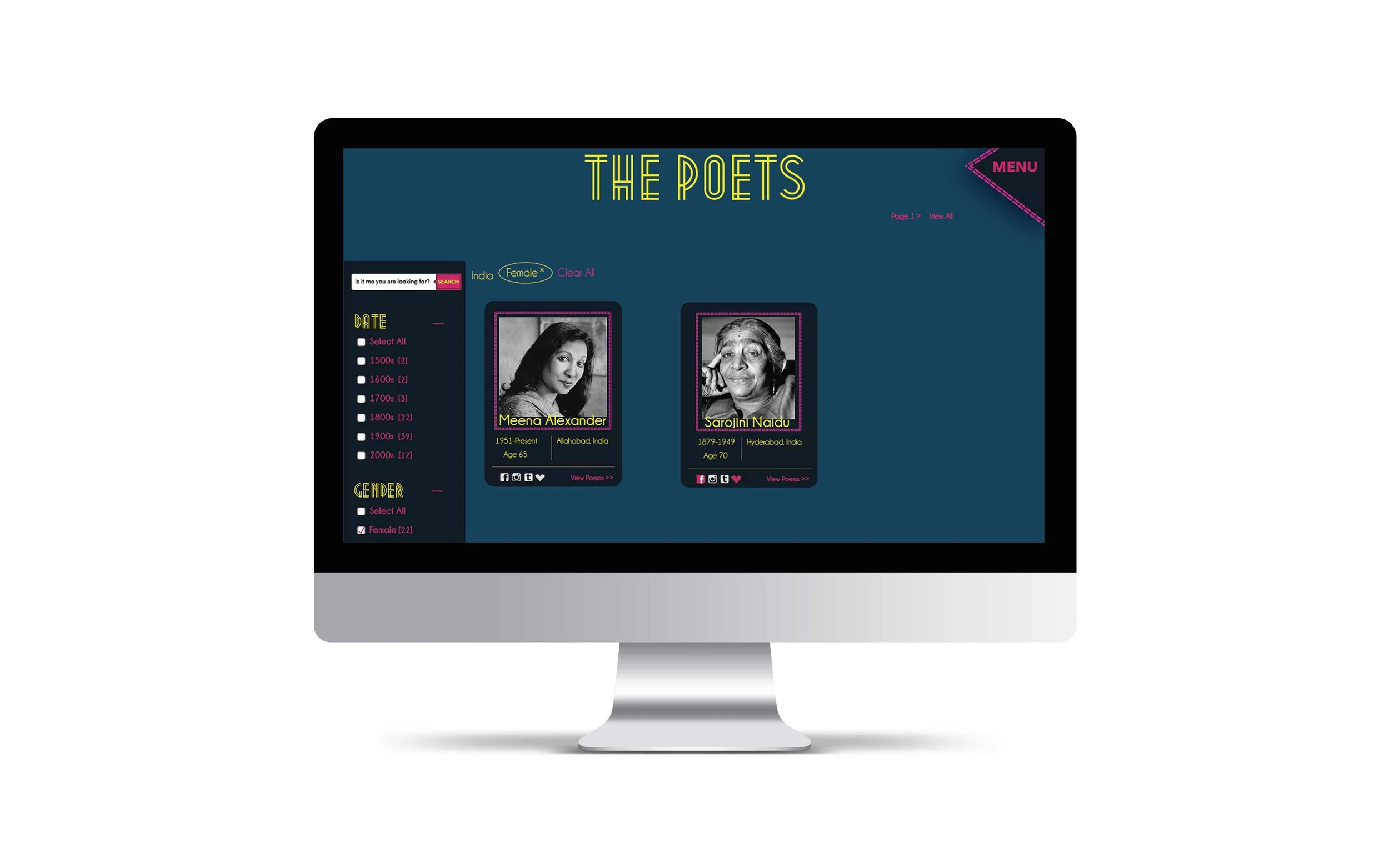
This website contains 50 Poets organized by different categories with a section dedicated to “community” and bringing people together in participation; people are not only able to peruse 50 famous poets, but also numerous amateur poets. The amateur poets can have their poems critiqued and rated. There is also an option to submit your own poems if you’d like. This is a responsive site inspired by neon colors and art deco.
I started this journey by creating a site map to give myself an idea of how many pages I might be designing.
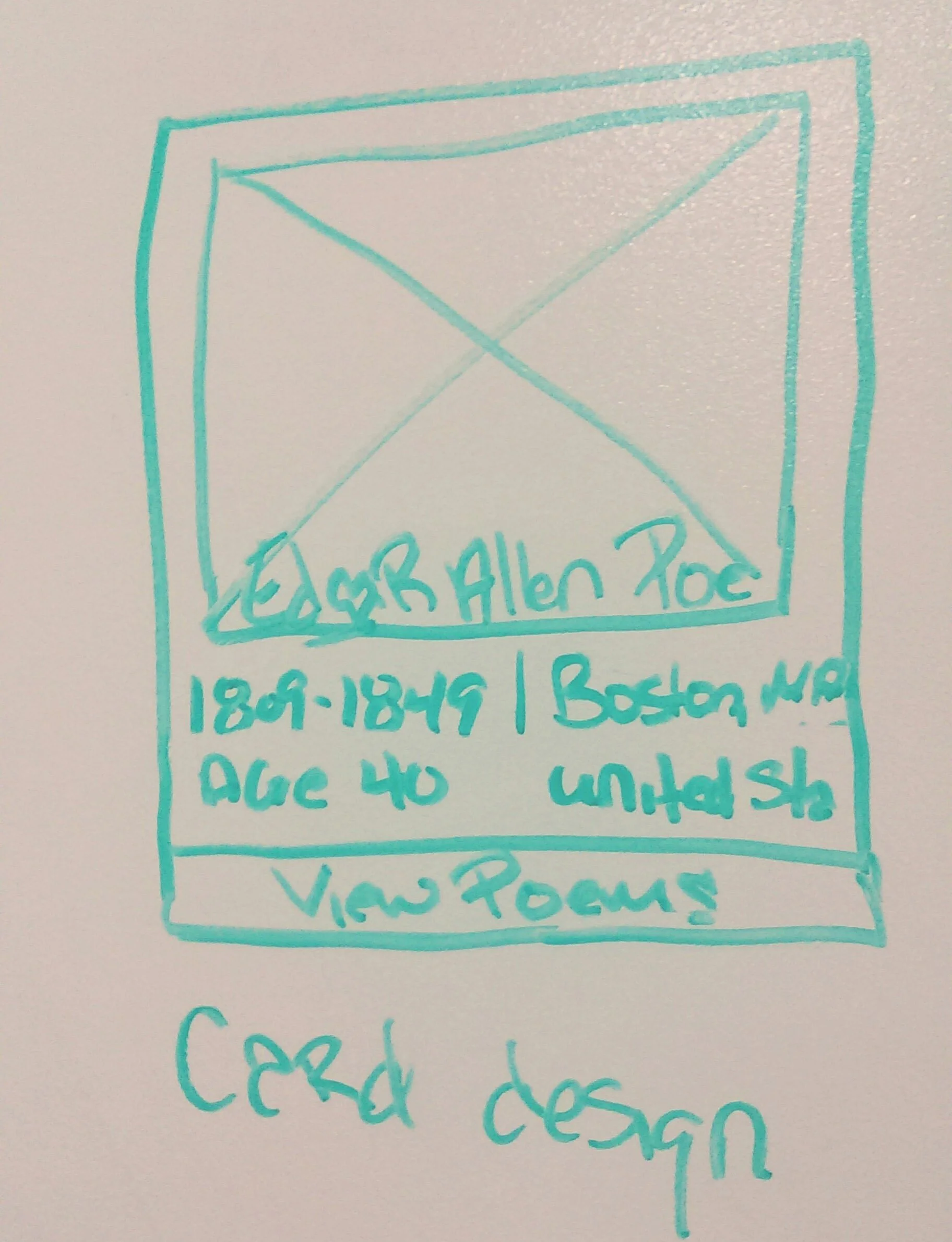
Next, I drew out on a whiteboard possible wireframe ideas – this helped to visualize many different ideas without wasting time perfecting them digitally.
From there I started working in Axure to perfect my ideas and test the UI with user scenarios. The user scenarios went well, two of the three people tested figured everything out right away and one, less tech-savvy person struggled a little. There was one area that needed to be fixed because it caused the most confusion.
After I redesigned my wireframes I was able to move into the actual design of the site. I was inspired by a picture taken at a bus stop in London. The picture featured neon colors against the blue-gray of the asphalt.
This picture inspired an art deco feel for the overall site. I knew I wanted to make poetry fun, that was the main goal. With that in mind and neon colors in hand, I went to work. The end result is a beautiful and fun website dedicated to one of my favorite things – poetry.


